There are a few questions that I want to know the answer to. Are the Covid-19 daily infections getting better or worse in the United States? What is the death rate of Covid-19 in the United States? Are we in the United States getting better at treating people with Covid-19? And there are many more questions I would like to know the answer to, but for now, I’ll try to see if I can answer these questions.
Continue reading Covid-19 death rate as of June 24, 2020Tag: United States
Covid-19 States to watch as of June 22, 2020
While I am finishing up the individual state charts for Covid-19 infections for the United States, there is something that I find both interesting and disturbing. It has now become obvious that the United States is no longer on a downward trend on the daily covid-19 infections. While the United States isn’t gaining infections exponentially, it has definitely started an upward trend.
The best way to see the change is to look at a 7 day average of the daily infection rates.
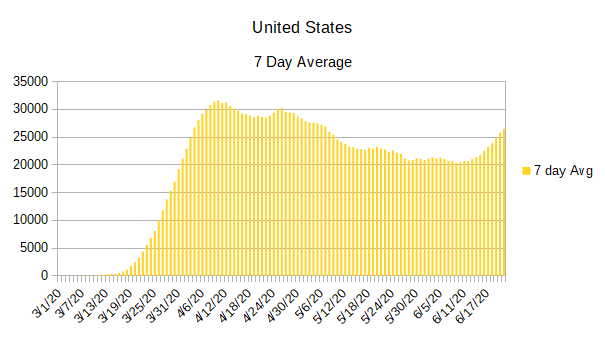
As you can see, sometime around June 11, 2020 the 7 day average began to change directions, but it was only in subsequent days that we could be sure it wasn’t just a short-term change.
Continue reading Covid-19 States to watch as of June 22, 2020Covid-19 update using June 13, 2020 data
I must admit that I liked the way that it looked when all the states were put in a list that was organized by their number of normalized daily infection rates. So, I’m going to do it again.
As you can see, there are a lot of changes from last week. While California still has the worst normalized daily infection rate, Texas moved up to the number two slot. Illinois, New York, and Virginia have each regained enough control of their infections that all three dropped out of the top five. They were replaced by Florida, Arizona, and North Carolina.
The five states with the lowest normalized daily infection rates remain the same even if some of them have changed position.
| California | 2,813 |
| Texas | 1,665 |
| Florida | 1,262 |
| Arizona | 1,078 |
| North Carolina | 1,057 |
| New York | 954 |
| Illinois | 946 |
| Virginia | 764 |
| Georgia | 732 |
| Maryland | 698 |
| Pennsylvania | 526 |
| Tennessee | 514 |
| New Jersey | 500 |
| Louisiana | 440 |
| Minnesota | 429 |
| Alabama | 424 |
| Ohio | 416 |
| South Carolina | 408 |
| Massachusetts | 405 |
| Indiana | 396 |
| Arkansas | 341 |
| Wisconsin | 340 |
| Utah | 329 |
| Iowa | 326 |
| Washington | 298 |
| Michigan | 288 |
| Mississippi | 283 |
| Colorado | 221 |
| Missouri | 214 |
| Kentucky | 211 |
| Nebraska | 204 |
| Connecticut | 199 |
| Nevada | 169 |
| New Mexico | 159 |
| Oklahoma | 109 |
| Kansas | 97 |
| Oregon | 84 |
| Rhode Island | 84 |
| District of Columbia | 78 |
| South Dakota | 65 |
| New Hampshire | 55 |
| Delaware | 53 |
| Idaho | 42 |
| North Dakota | 37 |
| Maine | 34 |
| West Virginia | 19 |
| Alaska | 14 |
| Vermont | 12 |
| Wyoming | 9 |
| Montana | 5 |
| Hawaii | 4 |
One thing that doesn’t show up in the above list is some of the dramatic increases that are happening in some of the individual states. In order to see that, you have to look at the graphs below. While the graphs don’t make it as easy to compare one state to the others as the above list does, it does make it easy to see how each individual state is doing over time.
Continue reading Covid-19 update using June 13, 2020 dataCovid-19 update using June 5, 2020 data
I want to start by simply listing the states and the number of normalized daily infections each state has. The normalized daily infections is a lagging indicator, but it has the advantage of smoothing out the infection rate and making it much easier to determine how the infections are proceeding in each state.
I have been using the normalized daily infection count as a sort order to make it easier to tell which states have the most daily cases of Covid-19 and which have the least. My hope is that by putting the states in this order, along with the number of infections as of the last calculation on normalized infections, it will provide a view that is easier to understand than looking at the charts alone.
If you are curious as to where these numbers appear on the individual charts, they will be the last line recorded in blue.
Since I am listing the states in descending order of their normalized daily infection rate, I am going to return to publishing the state graphs in alphabetical order.
| California | 2,548 |
| Illinois | 1,405 |
| Texas | 1,299 |
| New York | 1,291 |
| Virginia | 1,068 |
| Maryland | 882 |
| New Jersey | 813 |
| Massachusetts | 791 |
| Florida | 786 |
| North Carolina | 763 |
| Pennsylvania | 652 |
| Georgia | 628 |
| Minnesota | 567 |
| Arizona | 565 |
| Ohio | 499 |
| Alabama | 452 |
| Indiana | 445 |
| Wisconsin | 433 |
| Tennessee | 410 |
| Louisiana | 365 |
| Michigan | 353 |
| Iowa | 326 |
| Mississippi | 308 |
| Colorado | 302 |
| Nebraska | 277 |
| Washington | 268 |
| Connecticut | 263 |
| South Carolina | 256 |
| Utah | 209 |
| Arkansas | 205 |
| Kentucky | 190 |
| Missouri | 188 |
| New Mexico | 132 |
| Rhode Island | 125 |
| Nevada | 120 |
| Kansas | 104 |
| District of Columbia | 94 |
| Delaware | 92 |
| Oklahoma | 73 |
| New Hampshire | 66 |
| South Dakota | 65 |
| Oregon | 48 |
| Maine | 38 |
| West Virginia | 35 |
| Idaho | 35 |
| North Dakota | 25 |
| Wyoming | 10 |
| Alaska | 8 |
| Montana | 5 |
| Vermont | 4 |
| Hawaii | 1 |
And now we will take a look at the individual graphs of each state.
Continue reading Covid-19 update using June 5, 2020 dataCovid 19 update using May 29, 2020 data
I’m going to do something a little bit different with this week’s data. Instead of presenting the states in alphabetical order, I’m going to present them in the order of the largest number of daily cases reported for each state to the smallest number of daily cases reported. This should make it easier to see where the problem states are since the higher the number of normalized daily infections, the higher the state will be on the list.
You might have noticed that I am using normalized daily infections instead of reported daily infections for a sorting criteria. While it might not matter in some states, other states have gaps in their reporting data. Some days they might report zero cases and other days they might have huge numbers. Because of this reason, I had to have some way to consider the number of cases expected per day instead of the cases actually reported. Since the normalized daily infections already estimates infections per day — even if it lags by two weeks — I decided to use it as the sorting criteria.
From a perspective of the entire United States, the daily infections still seem to be trending down. That said, it looks like the curve is going down less than it has been in recent weeks. If this turns out to be the case, then we might be leveling off to a steady background infection rate that could continue through the summer and into fall. While I am not a medical professional, that wouldn’t seem to be all that surprising considering what I have read from infectious disease researchers. When a novel (never having existed before) infection becomes a pandemic, there is no natural resistance to the disease and therefore there are so many people susceptible to the disease that herd immunity doesn’t initially come into play. The means that the infection can spread even in less-than-ideal conditions. And with how easy covid-19 spreads from person to person — at least in ideal conditions — it might not go away through the summer even if it is more of a seasonal infection.
This brings to mind a second thing I have been watching out for. It is possible that, because of the warm and humid weather, covid-19 is being kept partially in check through the late spring, summer, and early fall. If that turns out to be the case, then when conditions are again right, we can expect a return to geometric growth unless we take drastic actions to keep the spread in check.
The evidence for seasonal outbreaks of covid-19 is strengthened by the fact that the worst outbreaks are now happening in the southern hemisphere as they go through fall and into winter. On the other hand, the places where covid-19 are spreading geometrically are also places where people are packed together, medical assistance is limited, and governments haven’t significantly tried to reduce spread beyond a few targeted measures.
While it is still too early to determine the seasonal strength of covid-19, it is something that needs to be watched closely.
As for the individual states of the United States, there are a few things that stand out when I placed the states in descending order of daily infections. One thing in general is that the states that have migrated to the top are list have never really got their covid-19 infections under control. While it is true that none of those states are on an exponential curve, they also haven’t managed to significantly bring down their daily infections except for a few states that really stand out for their improvements.
As for the states that are at the top of the list and have brought down their daily infections, it only serves to show just how severe the initial infections were in those states. New York and New Jersey have significantly reduced their daily infections yet they are still struggling with around 1000 infections per day.
For the most part, the middle of the group of states have either reached their peak and began to slowly lower their daily infection rates, or they have very slowly rising infection rates.
At the bottom of the list, the states that have done the best have generally had very low infection rates as well as reaching their peak and reducing their infections. Most of the states at the tail end of the list are also low population states or have geographically limiting features that helped them control the flow of people through their state like Hawaii.
So here are the current outbreaks by state (including the District of Columbia as its own entry) in the United States sorted in order.
Continue reading Covid 19 update using May 29, 2020 dataCovid 19 update as of May 22, 2020
We continue to reduce our overall number of Covid-19 cases in the United States. This is in large part due to the dramatic progress that has been made in New York and New Jersey. If those two states are removed from the totals, the Covid-19 cases in the United States is about holding steady.
Another good point that is shown in the data is that every state has been able to break the exponential growth curve even if some of them are still trending upward in their daily infection rates.
Continuing with the good news, there is now enough data to indicate that beginning to reopen the states hasn’t had an overly negative influence in the infection rate of Covid-19. While some states have had an increased number of daily infections, other states have either held steady or continued to reduce their daily infection rates.
Now for some bad news. It doesn’t look like the Covid-19 infection is going away any time soon. The data indicates that the infections will continue to spread throughout the United States into the foreseeable future.
So, let’s have a look at the graphs of the individual states:
Continue reading Covid 19 update as of May 22, 2020Covid 19 update as of May 15, 2020
The Covid-19 graphs have been made using the dataset provided by the Center for Systems Science and Engineering (CSSE) at Johns Hopkins University at their GitHub page. The data used end on May 15, 2020 for the United States. In addition to the state and federal graphs, I want to include a project that I have been working on.
I have been working on processing the data from each county in the United States to show whether they are suffering from an outbreak of Covid-19 or not. Last Wednesday was the first day that I posted preliminary data from each county. Since then, I have honed the math and I believe that I can create a better picture of which counties should be monitored closely for Covid-19 outbreaks.
One of the main changes to the algorithm was to separate “hotspots” from outbreaks. I am using the term hotspot to indicate that there is at least a 7.5% rise in cases in the county resulting in at least 15 new Covid-19 infections. Hotspots, being relatively small increases, should be easier to control but would indicate that attention should be paid. On the other hand, hotspots could also be misleading since it would be easy to reach such a low threshold from testing while not necessarily indicating that Covid-19 is spreading as rapidly as indicated.
Hotspots are also unique in the sense that a county might start off as a hotspot, grow into an outbreak, get the outbreak under control, and pass through the hotspot stage again. Because of this fact, hotspots should be looked at closely instead of assuming that they are in the process of becoming outbreaks themselves.
Outbreaks are calculated virtually the same as I had calculated them in the past. They require at least a 15% rise in cases in the county resulting in at least 50 new Covid-19 cases. This metric seems to indicate that the outbreak has escaped the typical controls that are in place for the given county. While an outbreak could be indicated as a side effect of heavy testing in an area, it is much more likely that it would be indicated by unrestrained community spreading of the virus.
As always, here are a few things to keep in mind while you are looking over the results presented here:
- Each graph covers the dates from March 1, 2020 through May 15, 2020.
- Daily reported infections are recorded in red.
- Normalized infections are recorded in blue.
- The x-axis indicates the date.
- The y-axis indicates the number of Covid-19 infections (reported or normalized) on that date.
- Each y-axis is best fit. While this makes it easy to view the overall trend for the state, care must be taken when making comparisons to note the actual number of cases between different graphs.
- Negative numbers should never be present and are no longer shown on the graphs. Negative numbers would normally indicate a reporting error. One reason to ignore them is that they are small enough to not significantly effect the data presented.
With this new data in mind, here are the results for the week:
Continue reading Covid 19 update as of May 15, 2020May 13, 2020 update — U.S. Counties with Covid-19 Outbreaks
While it is nice to see the overall picture of the Covid-19 outbreak in the United States as well as being able to see how the individual states are doing, that leaves the question of where the real outbreaks are located.
The Center for Systems Science and Engineering (CSSE) at Johns Hopkins University publishes data daily on their GitHub page. The data is broken down to the county level. All that remained was for me to go through the data and see which individual counties were having the largest outbreaks.
So how did I determine who was having the largest outbreak? I used two criteria.
The first criteria was that there had to be more than a 19% growth rate over the last week. That served to eliminate random spikes in reported infection rates due to returning test results. Also, while 19% is a fairly high growth rate, it is more indicative of unrestrained growth instead of being the result of constant testing.
The second criteria was that there needed to be a minimum of 50 new infections reported over the previous week. This served to help remove false positives showing large growth rates from the list that resulted from very small numbers of infections. For example, a county that moved from 2 reported cases to 4 reported cases in one week would show as a staggering 200% growth rate, but that doesn’t indicate an outbreak as far as I’m concerned.
What do those two criteria leave out? The most obvious places that would be left out were places like New York where they still have large numbers of infections but they have their growth rate under control. Other places that were left out were counties that have few infections to date but are rapidly growing.
Remember: there are very few places in the United States that remain untouched by Covid-19. And for those places that remain untouched, they are within a leisurely driving distance from a place where they can become infected.
With those criteria in mind, here are where the outbreaks are currently happening in the United States.
Continue reading May 13, 2020 update — U.S. Counties with Covid-19 OutbreaksCovid-19 update 1: data as the United States begins to open.
As the United States begins to open from its Covid-19 shutdown, it is important to get a baseline to see how the disease progresses as the stay-at-home orders begin to wane. To create a yardstick, I will be relying on data from Johns Hopkins University available at their GitHub page [https://github.com/CSSEGISandData/COVID-19]. After I process the data, that should give a snapshot of the condition of each individual state as well as an overall view of the United States. With the snapshot in place, it will be easier to see how the infection rate changes over time.
To process the data into easily readable form, I first take the total of infections per day and spread them out through a skewed normal curve. I use a normal graph that is skewed to the left to help distribute the raw data into the most likely time that the person was actually infected instead of the time when they received a positive test result. The downside to processing the data like this is that it is a trailing indicator. In other words, it shows what the infection rate would have been about two weeks prior to the last data available. In order to help compensate for the lag in processed data, I also put the raw data into the same chart. That makes it easier to see where the data might be going over time.
Here is a graph of the United States using the data available as of the end of the day on April 28, 2020.

The “reported” data is taken directly from the data provided by Johns Hopkins University while the “normalized” data is the same data processed through normal distribution.
With the data processed this way, it is easy to see the initial growth rate as well as when it peaked and started down.
The overall downward trend for the United States is what I would expect considering that the states that had the worst outbreaks are rapidly bringing those outbreaks under control. But this doesn’t tell the entire story. As we have all seen, the picture of the United States doesn’t necessarily indicate how each individual part is doing. There are several states that are bringing their daily infections under control while there are others that are still spreading on an exponential curve. Furthermore, as each state applies its own rules to reopening, it’s quite likely that each state will diverge from the others with respect to their infection rate.
Since showing a graph of each state every time I update would be prohibitive, I will show a few that are opening early.
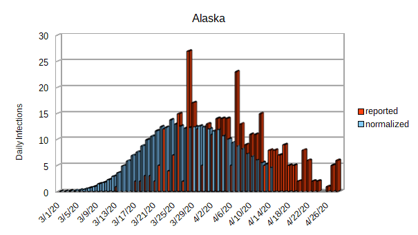
As you can see from the graph of Alaska, they seem to have their outbreak well in hand. Alaska never had a very big outbreak; notice the y-axis and that they are only getting about 5 infections per day. It shouldn’t take much of an effort to keep their outbreak under control.
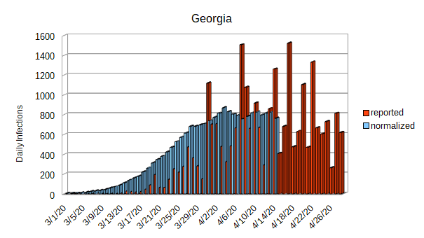
Georgia is the next state that I want to look at. While Georgia has flattened their curve, they haven’t done much to actually reduce the number of daily infections. With between 600 and 800 daily infections, it will be easy for them to slip back into a exponential growth rate. Even if they manage to escape an exponential growth rate when they begin to return to work, 600 to 800 new cases of Covid-19 per day will serve to maintain a stress on their healthcare system.
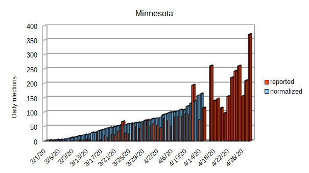
Minnesota is trying to open their economy a little bit while still maintaining their stay-at-home order. While their daily infection rate isn’t outrageous, it doesn’t appear to have reached its peak yet.

Mississippi is another state that is trying to reopen their economy. They, too, might not have reached their peak.
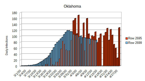
Oklahoma appears to have had an initial success of reaching their peak and even starting to reduce their daily infection rate. On the other hand, Oklahoma is being fairly aggressive in reopening their businesses. This state could be the canary in the coalmine as far as whether the daily infection rates begin to clime again after the economy starts to reopen.

South Carolina is in much the same position as Oklahoma with respect to their daily infection rate and reopening strategy. Perhaps they are another canary in the coalmine.

Finally that brings us to Tennessee. While they have flattened their curve, they don’t seem to have reduced the daily infection rate. They are also being very aggressive with their reopening plans. Over the next few days, they are going to remove all stay-at-home restrictions and rely completely on social distancing to try to maintain their daily infection rates.
And that concludes the states that are leading the charge to reopen. It will be educational to see which, if any, of these states manage to keep their daily infection rate in check. The fate of these states is in the hands of their citizens. Whether they take the threat of Covid-19 seriously when they return to work or whether they end up being the first states to require a second round of stay-at-home orders remains to be seen.
