I want to start by simply listing the states and the number of normalized daily infections each state has. The normalized daily infections is a lagging indicator, but it has the advantage of smoothing out the infection rate and making it much easier to determine how the infections are proceeding in each state.
I have been using the normalized daily infection count as a sort order to make it easier to tell which states have the most daily cases of Covid-19 and which have the least. My hope is that by putting the states in this order, along with the number of infections as of the last calculation on normalized infections, it will provide a view that is easier to understand than looking at the charts alone.
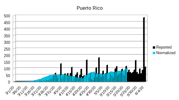
If you are curious as to where these numbers appear on the individual charts, they will be the last line recorded in blue.
Since I am listing the states in descending order of their normalized daily infection rate, I am going to return to publishing the state graphs in alphabetical order.
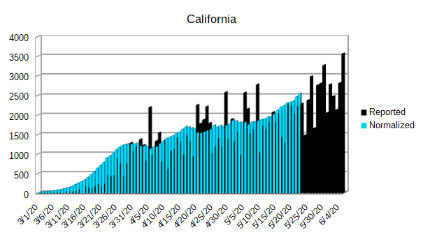
| California | 2,548 |
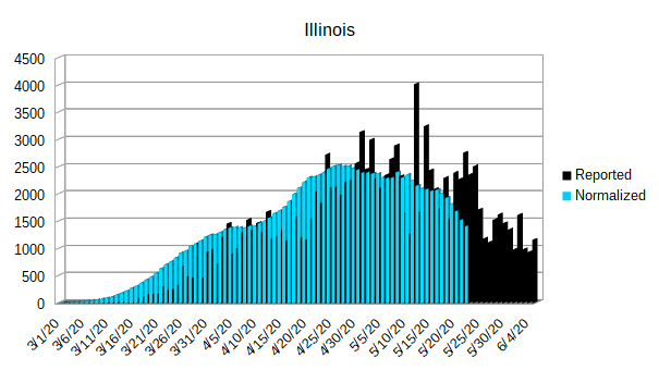
| Illinois | 1,405 |
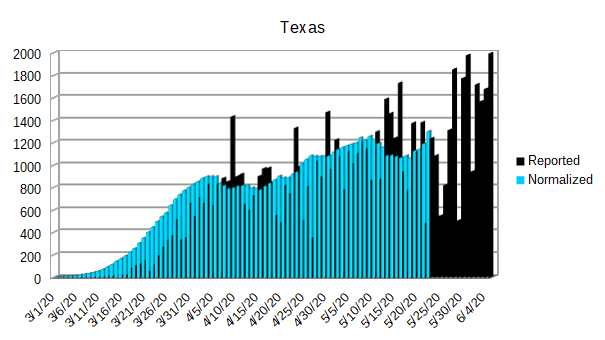
| Texas | 1,299 |
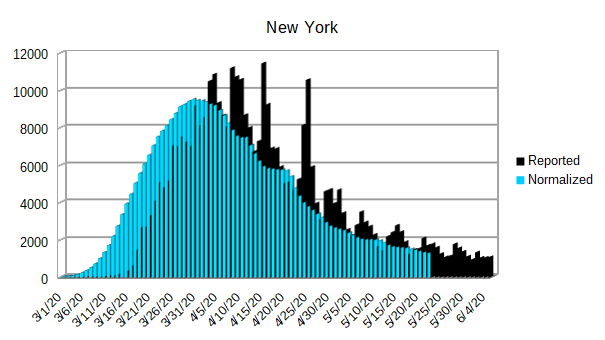
| New York | 1,291 |
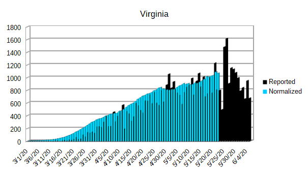
| Virginia | 1,068 |
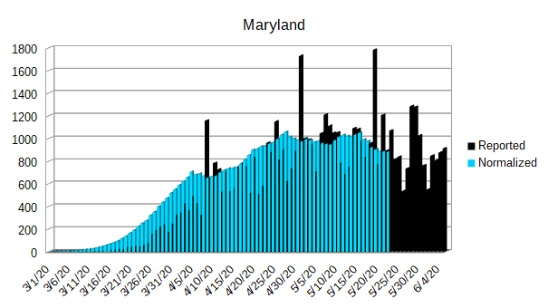
| Maryland | 882 |
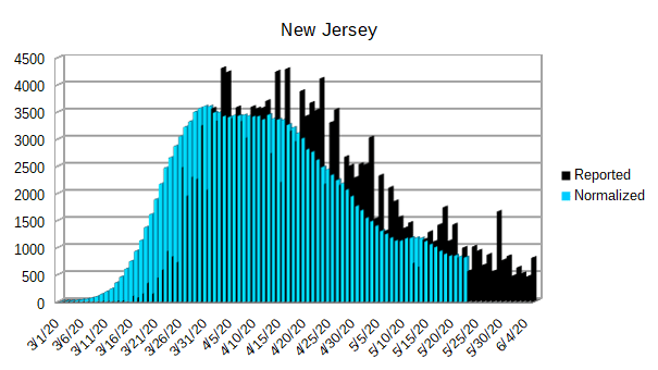
| New Jersey | 813 |
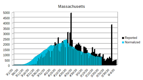
| Massachusetts | 791 |
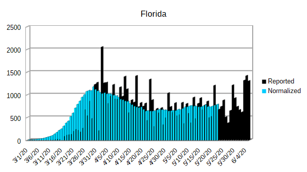
| Florida | 786 |
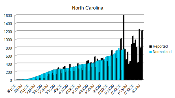
| North Carolina | 763 |
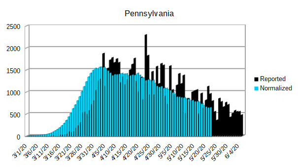
| Pennsylvania | 652 |
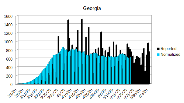
| Georgia | 628 |
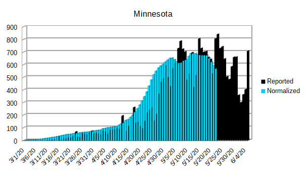
| Minnesota | 567 |
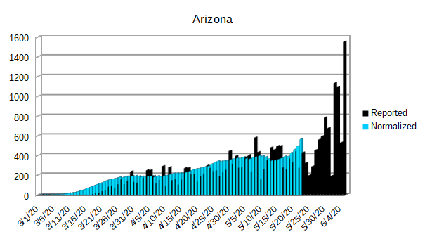
| Arizona | 565 |
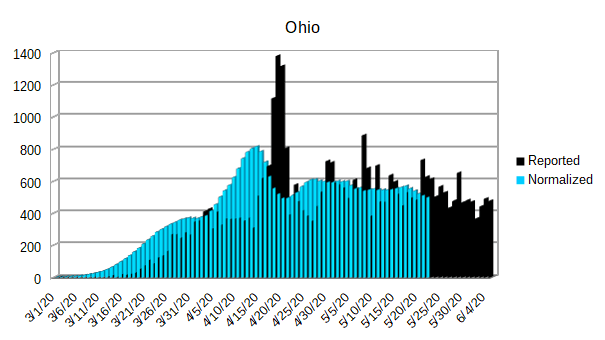
| Ohio | 499 |
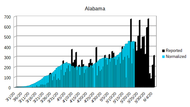
| Alabama | 452 |
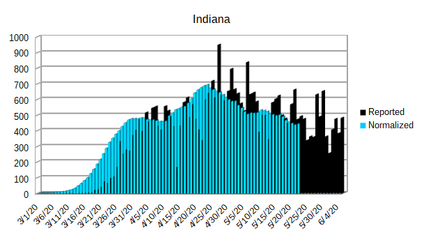
| Indiana | 445 |
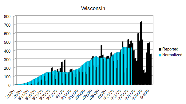
| Wisconsin | 433 |
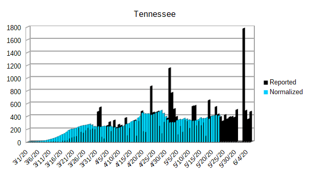
| Tennessee | 410 |
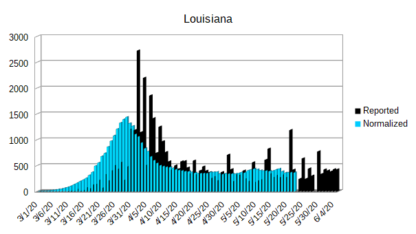
| Louisiana | 365 |
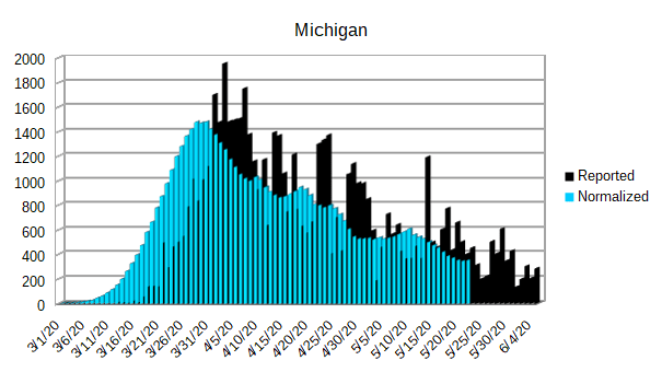
| Michigan | 353 |
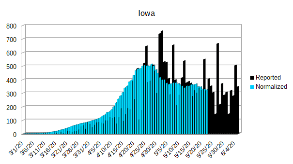
| Iowa | 326 |
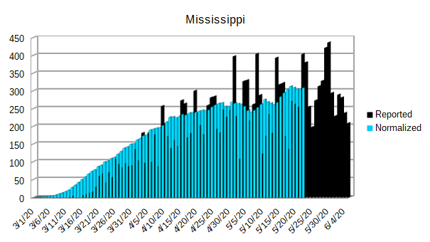
| Mississippi | 308 |
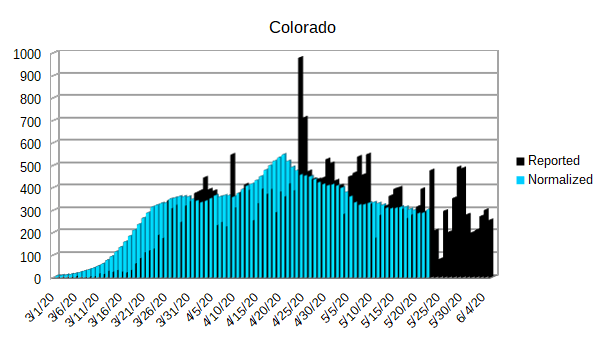
| Colorado | 302 |
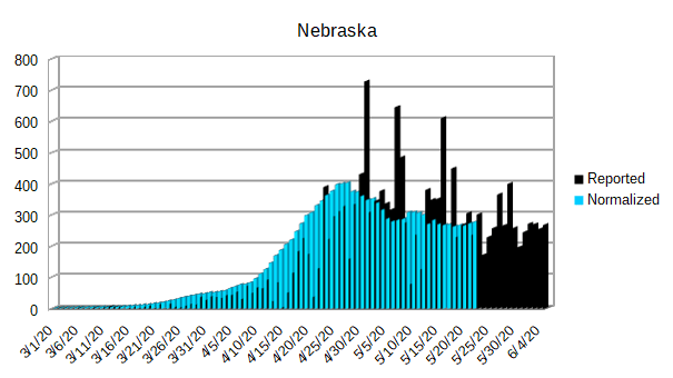
| Nebraska | 277 |
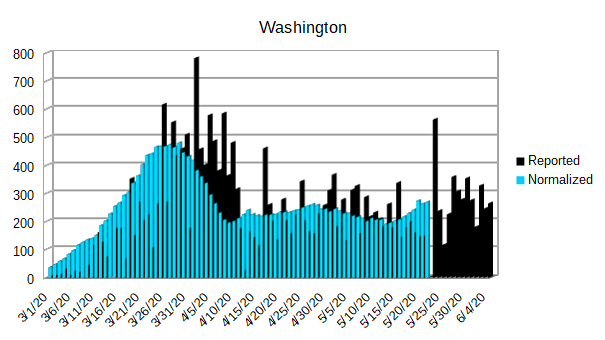
| Washington | 268 |
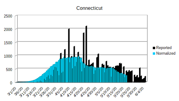
| Connecticut | 263 |
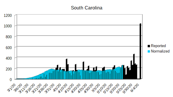
| South Carolina | 256 |
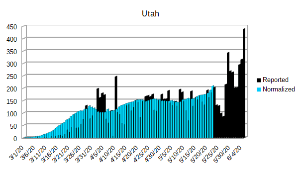
| Utah | 209 |
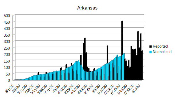
| Arkansas | 205 |
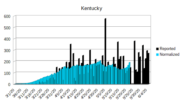
| Kentucky | 190 |
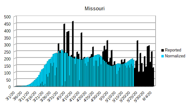
| Missouri | 188 |
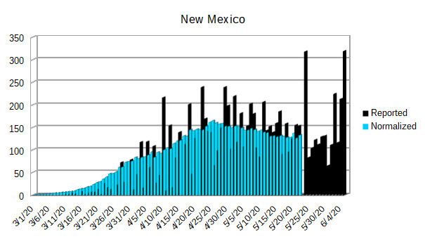
| New Mexico | 132 |
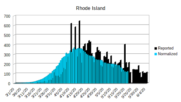
| Rhode Island | 125 |
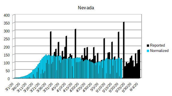
| Nevada | 120 |
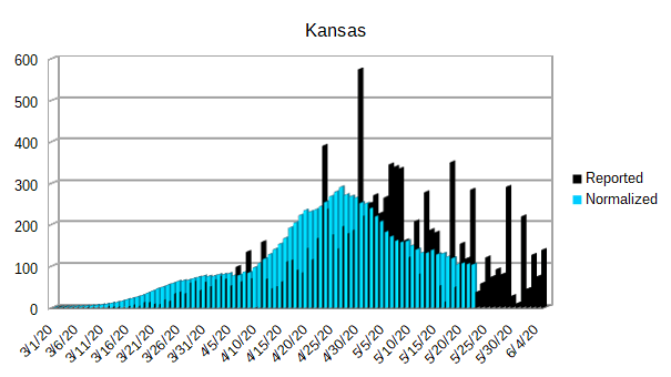
| Kansas | 104 |
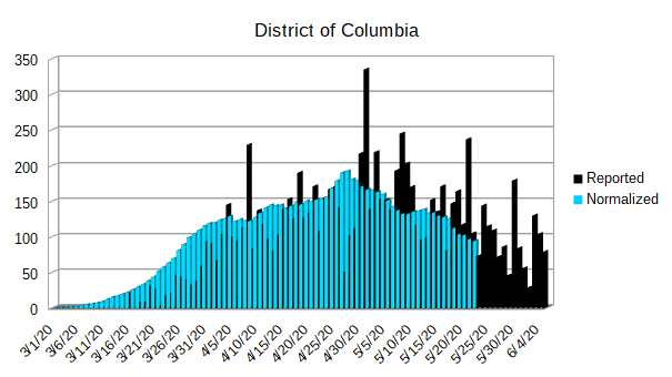
| District of Columbia | 94 |
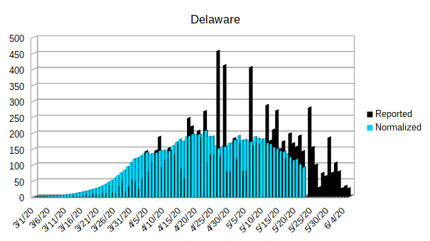
| Delaware | 92 |
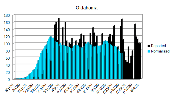
| Oklahoma | 73 |
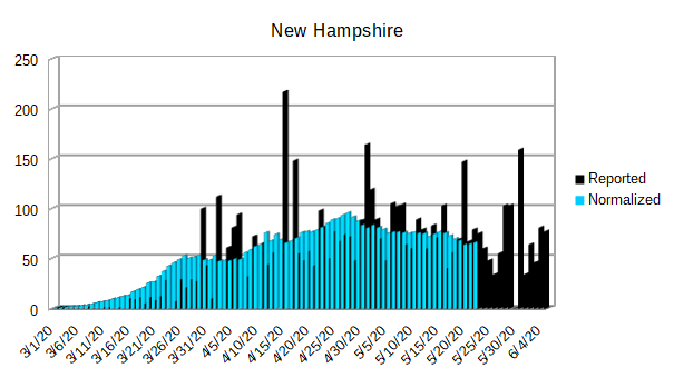
| New Hampshire | 66 |
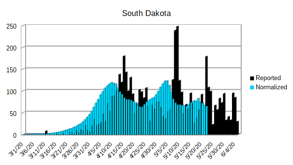
| South Dakota | 65 |
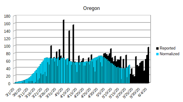
| Oregon | 48 |
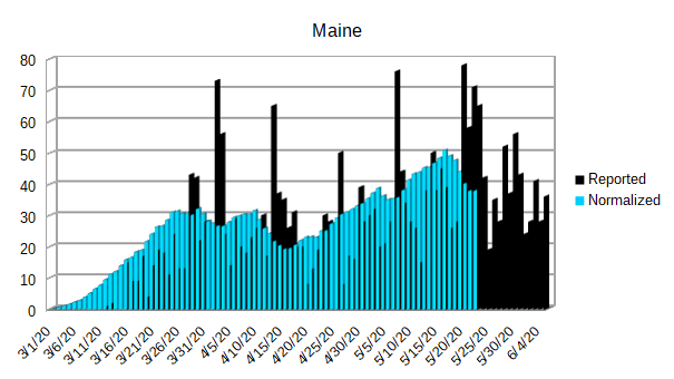
| Maine | 38 |
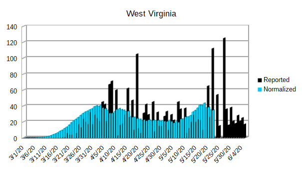
| West Virginia | 35 |
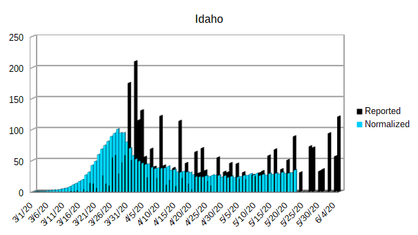
| Idaho | 35 |
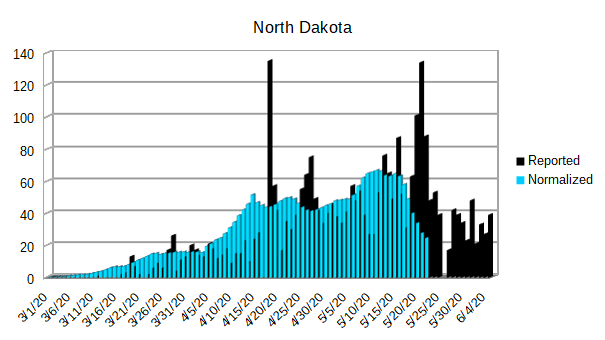
| North Dakota | 25 |
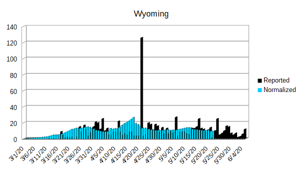
| Wyoming | 10 |
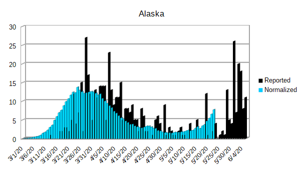
| Alaska | 8 |
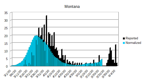
| Montana | 5 |
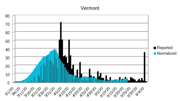
| Vermont | 4 |
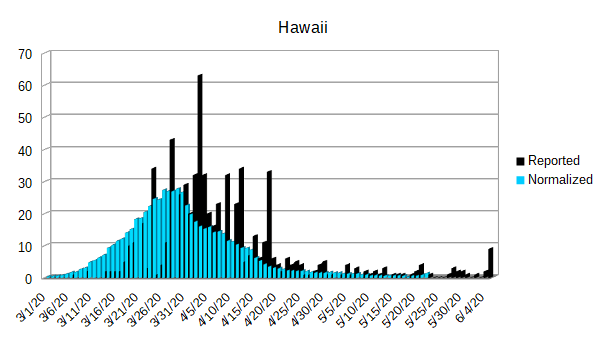
| Hawaii | 1 |
And now we will take a look at the individual graphs of each state.
As always, there are a few things to be aware of on each graph.
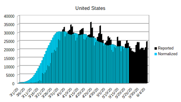
- The black cylinders indicate the reported daily infections.
- The blue cylinders indicate the normalized daily infections.
- The y-axis of each graph is best fit. That means that each y-axis is scaled to fit the data into identical sized graphs.
- The graph data begins on March 1, 2020 and goes through June 5, 2020.
- The District of Columbia is reported separate in the data, so I have graphed it separately and included it under the United States.
- I have included Puerto Rico since it is an American territory and is currently suffering its own outbreak.
From the perspective of the United States, it appears that the reported daily infections are continuing to level out. While it is my hope that they will continue to decline, I suspect that we will continue to see a certain amount of cases that continue throughout the summer and into the early fall.
While there is no way to be sure, I am expecting to see a resurgence of Covid-19 in the fall. There are strong indications that, barring unexpected mutations, the virus is going to be seasonal. One reason that it isn’t going away this summer seems to be a combination of it being extremely contagious and there still being so many susceptible people.