Writing in LibreOffice for WordPress

One of the many things that LibreOffice does exceptionally well is formatting mathematical expressions. Since I on working with matrices quite a bit in the near future, I thought it might benefit me to see write in LibreOffice.

While I can write notes for myself in LibreOffice quite easily, the question becomes: can I share them on WordPress? And if I can, will WordPress display the matrices that I have created correctly or will they be mangled?

We shall soon see.

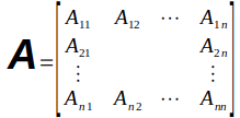
Here is an example matrix that was given by the LibreOffice how-to pages:

It is very easy to create and put in place. It looks fantastic in LibreOffice.

Next, here is a matrix that I have created myself using a much simpler version of the formula.

Now, I am going to save this as a html file and see if I can copy and paste it into the new WordPress block editor.

End result:

It seems like it works quite well. There is a downside, though. When I saved the document from LibreOffice’s default ‘odt’ format to ‘html’ format, it exported the formulas as images. When I copied the entire html file to WordPress’s new block editor, it left blanks for each of the images that needed to be inserted. While not a perfect solution, I think that is probably my best bet for now.

Linear algebra basics

Unfortunately when I was taking linear algebra in college, I didn’t realize just how important it would later in my life. While I do remember plenty of the basics, there is also huge holes in my knowledge of linear algebra. These holes became apparent when I started doing extensive work in the area of data analysis.

It is time to correct this problem.

As a starting point, I will be using the linear algebra videos from 3blue1brown on YouTube to quickly cover the basics. These notes will be covering the first of his videos titled Vectors, what even are they? Essence of linear algebra, chapter 1 available on YouTube here.

Useful Unicode for inputting vector notation in Linux

To input Unicode into Linux, hold down the control and shift key while pressing the ‘u’ key. The ‘u’ will be underlined at that point. Then type in the four digit code for the character that you want to input. Here are the codes that I use to create vector notation in a text document:

u23a7 ⎧   u23ab ⎫
u23aa ⎪   u23aa ⎪
u23a9 ⎩   u23ad ⎭

A dot product is represented by u00b7 ·
A cross product is represented by an x.

While these codes should be useful in all operating systems, the way that they are input will differ.

Vectors are rooted at the origin of the coordinate system

While this isn’t specifically true in all cases, that is the convention that we will be using for the time being. By placing the tail of the vector at the origin of the coordinate system, that makes vector addition and scalar multiplication easy and intuitive. Later, if it becomes necessary, we can take the view of vectors that are at arbitrary places within the coordinate system.

In a two dimensional space, the origin is the point where the x-axis crosses the y-axis. This is usually designated mathematically as the point (0, 0). In a three dimensional space, it is the point where the x-axis, y-axis, and z-axis meet. In three dimensional space, it would be designated by the point (0, 0, 0).

That brings us to our first distinction in linear algebra. In linear algebra, we are working with vectors, not points. To distinguish between them. they are usually written on top of each other and surrounded by square brackets instead of curved brackets.

⎧5⎫
⎩4⎭

You can think of the numbers given in a vector as the instructions to get from the tail of the vector to the tip of the vector. The top number tells how far to move on the x-axis, the second number tells how far to move along the y-axis, and the third number (if available) tells how far to move along the z-axis.

This convention can be extended into more than three dimensions if desired.

Vector addition

To add two vectors, imagine both of them with their root at the origin. Then, imagine the second vector moving its root to the tip of the first vector while still maintaining its direction and magnitude. The resulting vector, rooted at the origin, will have its tip at the end of the second vector.

This can be expressed mathematically as follows:

⎧1⎫   ⎧3 ⎫   ⎧  1+3 ⎫   ⎧4⎫
⎩2⎭ + ⎩-1⎭ = ⎩2+(-1)⎭ = ⎩1⎭

Scaling a vector (multiplication by a number)

A scalar is a number that scales a vector. Pretty well every stand-alone number in linear algebra can be thought of as a scalar. What a scalar does is shrink, extend, and/or change directions of a vector while maintaining its origin and the line upon which it sits.

Negative numbers change the vector’s direction while positive numbers maintain the vector’s direction. The scaling is determined by the magnitude of the number. For example

  ⎧3⎫   ⎧6⎫
2·⎩1⎭ = ⎩2⎭

All you have to do is multiply each component of the vector by the scalar. That has the function of stretching (or shrinking) the vector. And if the scalar is negative, it will also flip the direction of the vector.
Getting Python running under Linux Mint 20

I recently installed the latest version of Linux Mint on my machine. As wonderful as this operating system is, I have still run into one problem. On occasions, python scripts would fail. Linux Mint comes with Python 2 and Python 3 installed by default. So why would it fail?

Python can fail to run on Linux Mint due the way that certain scripts call on python.

At the start of a script in Linux it has a “shebang” telling Linux what interpreter it needs to run. It looks something like this:

#!/usr/bin/python

When the script writer calls for ‘python,’ they are actually calling for Python 2. The problem is that Linux Mint, while having Python 2 installed, doesn’t have a link to it called ‘python.’

The solution is simple. All I had to do was add a symbolic link for ‘python’ to call ‘python2.7.’ To accomplish this, I did the following:

  • Open a terminal window.
  • type ‘cd /usr/bin’
  • type ‘ls python*’

At this point, I saw that Linux Mint had Python 2.7 and Python 3.8 installed. It also had symbolic links connecting python2 to Python 2.7 and python3 to Python 3.8.

I added a symbolic link called ‘python’ and connected it to python2.7. To do this, type the following:

sudo ln -s /usr/bin/python /usr/bin/python2.7

You will then be prompted for your password. If successful, you will have created a link in the /usr/bin directory called ‘python.’ When a script tries to use ‘python’ it will be sent to the Python 2.7 interpreter and should run normally.

Covid-19 death rate as of June 24, 2020

There are a few questions that I want to know the answer to. Are the Covid-19 daily infections getting better or worse in the United States? What is the death rate of Covid-19 in the United States? Are we in the United States getting better at treating people with Covid-19? And there are many more questions I would like to know the answer to, but for now, I’ll try to see if I can answer these questions.

Continue reading Covid-19 death rate as of June 24, 2020

Covid-19 States to watch as of June 22, 2020

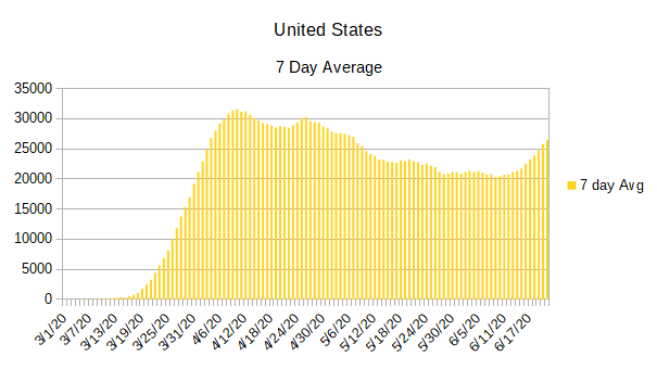
While I am finishing up the individual state charts for Covid-19 infections for the United States, there is something that I find both interesting and disturbing. It has now become obvious that the United States is no longer on a downward trend on the daily covid-19 infections. While the United States isn’t gaining infections exponentially, it has definitely started an upward trend.

The best way to see the change is to look at a 7 day average of the daily infection rates.

As you can see, sometime around June 11, 2020 the 7 day average began to change directions, but it was only in subsequent days that we could be sure it wasn’t just a short-term change.

Continue reading Covid-19 States to watch as of June 22, 2020

Covid-19 update using June 13, 2020 data

I must admit that I liked the way that it looked when all the states were put in a list that was organized by their number of normalized daily infection rates. So, I’m going to do it again.

As you can see, there are a lot of changes from last week. While California still has the worst normalized daily infection rate, Texas moved up to the number two slot. Illinois, New York, and Virginia have each regained enough control of their infections that all three dropped out of the top five. They were replaced by Florida, Arizona, and North Carolina.

The five states with the lowest normalized daily infection rates remain the same even if some of them have changed position.

California2,813
Texas1,665
Florida1,262
Arizona1,078
North Carolina1,057
New York954
Illinois946
Virginia764
Georgia732
Maryland698
Pennsylvania526
Tennessee514
New Jersey500
Louisiana440
Minnesota429
Alabama424
Ohio416
South Carolina408
Massachusetts405
Indiana396
Arkansas341
Wisconsin340
Utah329
Iowa326
Washington298
Michigan288
Mississippi283
Colorado221
Missouri214
Kentucky211
Nebraska204
Connecticut199
Nevada169
New Mexico159
Oklahoma109
Kansas97
Oregon84
Rhode Island84
District of Columbia78
South Dakota65
New Hampshire55
Delaware53
Idaho42
North Dakota37
Maine34
West Virginia19
Alaska14
Vermont12
Wyoming9
Montana5
Hawaii4

One thing that doesn’t show up in the above list is some of the dramatic increases that are happening in some of the individual states. In order to see that, you have to look at the graphs below. While the graphs don’t make it as easy to compare one state to the others as the above list does, it does make it easy to see how each individual state is doing over time.

Continue reading Covid-19 update using June 13, 2020 data

Covid-19 update using June 5, 2020 data

I want to start by simply listing the states and the number of normalized daily infections each state has. The normalized daily infections is a lagging indicator, but it has the advantage of smoothing out the infection rate and making it much easier to determine how the infections are proceeding in each state.

I have been using the normalized daily infection count as a sort order to make it easier to tell which states have the most daily cases of Covid-19 and which have the least. My hope is that by putting the states in this order, along with the number of infections as of the last calculation on normalized infections, it will provide a view that is easier to understand than looking at the charts alone.

If you are curious as to where these numbers appear on the individual charts, they will be the last line recorded in blue.

Since I am listing the states in descending order of their normalized daily infection rate, I am going to return to publishing the state graphs in alphabetical order.

California2,548
Illinois1,405
Texas1,299
New York1,291
Virginia1,068
Maryland882
New Jersey813
Massachusetts791
Florida786
North Carolina763
Pennsylvania652
Georgia628
Minnesota567
Arizona565
Ohio499
Alabama452
Indiana445
Wisconsin433
Tennessee410
Louisiana365
Michigan353
Iowa326
Mississippi308
Colorado302
Nebraska277
Washington268
Connecticut263
South Carolina256
Utah209
Arkansas205
Kentucky190
Missouri188
New Mexico132
Rhode Island125
Nevada120
Kansas104
District of Columbia94
Delaware92
Oklahoma73
New Hampshire66
South Dakota65
Oregon48
Maine38
West Virginia35
Idaho35
North Dakota25
Wyoming10
Alaska8
Montana5
Vermont4
Hawaii1

And now we will take a look at the individual graphs of each state.

Continue reading Covid-19 update using June 5, 2020 data

Covid 19 update using May 29, 2020 data

I’m going to do something a little bit different with this week’s data. Instead of presenting the states in alphabetical order, I’m going to present them in the order of the largest number of daily cases reported for each state to the smallest number of daily cases reported. This should make it easier to see where the problem states are since the higher the number of normalized daily infections, the higher the state will be on the list.

You might have noticed that I am using normalized daily infections instead of reported daily infections for a sorting criteria. While it might not matter in some states, other states have gaps in their reporting data. Some days they might report zero cases and other days they might have huge numbers. Because of this reason, I had to have some way to consider the number of cases expected per day instead of the cases actually reported. Since the normalized daily infections already estimates infections per day — even if it lags by two weeks — I decided to use it as the sorting criteria.

From a perspective of the entire United States, the daily infections still seem to be trending down. That said, it looks like the curve is going down less than it has been in recent weeks. If this turns out to be the case, then we might be leveling off to a steady background infection rate that could continue through the summer and into fall. While I am not a medical professional, that wouldn’t seem to be all that surprising considering what I have read from infectious disease researchers. When a novel (never having existed before) infection becomes a pandemic, there is no natural resistance to the disease and therefore there are so many people susceptible to the disease that herd immunity doesn’t initially come into play. The means that the infection can spread even in less-than-ideal conditions. And with how easy covid-19 spreads from person to person — at least in ideal conditions — it might not go away through the summer even if it is more of a seasonal infection.

This brings to mind a second thing I have been watching out for. It is possible that, because of the warm and humid weather, covid-19 is being kept partially in check through the late spring, summer, and early fall. If that turns out to be the case, then when conditions are again right, we can expect a return to geometric growth unless we take drastic actions to keep the spread in check.

The evidence for seasonal outbreaks of covid-19 is strengthened by the fact that the worst outbreaks are now happening in the southern hemisphere as they go through fall and into winter. On the other hand, the places where covid-19 are spreading geometrically are also places where people are packed together, medical assistance is limited, and governments haven’t significantly tried to reduce spread beyond a few targeted measures.

While it is still too early to determine the seasonal strength of covid-19, it is something that needs to be watched closely.

As for the individual states of the United States, there are a few things that stand out when I placed the states in descending order of daily infections. One thing in general is that the states that have migrated to the top are list have never really got their covid-19 infections under control. While it is true that none of those states are on an exponential curve, they also haven’t managed to significantly bring down their daily infections except for a few states that really stand out for their improvements.

As for the states that are at the top of the list and have brought down their daily infections, it only serves to show just how severe the initial infections were in those states. New York and New Jersey have significantly reduced their daily infections yet they are still struggling with around 1000 infections per day.

For the most part, the middle of the group of states have either reached their peak and began to slowly lower their daily infection rates, or they have very slowly rising infection rates.

At the bottom of the list, the states that have done the best have generally had very low infection rates as well as reaching their peak and reducing their infections. Most of the states at the tail end of the list are also low population states or have geographically limiting features that helped them control the flow of people through their state like Hawaii.

So here are the current outbreaks by state (including the District of Columbia as its own entry) in the United States sorted in order.

Continue reading Covid 19 update using May 29, 2020 data

Covid 19 update as of May 22, 2020

We continue to reduce our overall number of Covid-19 cases in the United States. This is in large part due to the dramatic progress that has been made in New York and New Jersey. If those two states are removed from the totals, the Covid-19 cases in the United States is about holding steady.

Another good point that is shown in the data is that every state has been able to break the exponential growth curve even if some of them are still trending upward in their daily infection rates.

Continuing with the good news, there is now enough data to indicate that beginning to reopen the states hasn’t had an overly negative influence in the infection rate of Covid-19. While some states have had an increased number of daily infections, other states have either held steady or continued to reduce their daily infection rates.

Now for some bad news. It doesn’t look like the Covid-19 infection is going away any time soon. The data indicates that the infections will continue to spread throughout the United States into the foreseeable future.

So, let’s have a look at the graphs of the individual states:

Continue reading Covid 19 update as of May 22, 2020

Covid 19 update as of May 15, 2020

The Covid-19 graphs have been made using the dataset provided by the Center for Systems Science and Engineering (CSSE) at Johns Hopkins University at their GitHub page. The data used end on May 15, 2020 for the United States. In addition to the state and federal graphs, I want to include a project that I have been working on.

I have been working on processing the data from each county in the United States to show whether they are suffering from an outbreak of Covid-19 or not. Last Wednesday was the first day that I posted preliminary data from each county. Since then, I have honed the math and I believe that I can create a better picture of which counties should be monitored closely for Covid-19 outbreaks.

One of the main changes to the algorithm was to separate “hotspots” from outbreaks. I am using the term hotspot to indicate that there is at least a 7.5% rise in cases in the county resulting in at least 15 new Covid-19 infections. Hotspots, being relatively small increases, should be easier to control but would indicate that attention should be paid. On the other hand, hotspots could also be misleading since it would be easy to reach such a low threshold from testing while not necessarily indicating that Covid-19 is spreading as rapidly as indicated.

Hotspots are also unique in the sense that a county might start off as a hotspot, grow into an outbreak, get the outbreak under control, and pass through the hotspot stage again. Because of this fact, hotspots should be looked at closely instead of assuming that they are in the process of becoming outbreaks themselves.

Outbreaks are calculated virtually the same as I had calculated them in the past. They require at least a 15% rise in cases in the county resulting in at least 50 new Covid-19 cases. This metric seems to indicate that the outbreak has escaped the typical controls that are in place for the given county. While an outbreak could be indicated as a side effect of heavy testing in an area, it is much more likely that it would be indicated by unrestrained community spreading of the virus.

As always, here are a few things to keep in mind while you are looking over the results presented here:

  • Each graph covers the dates from March 1, 2020 through May 15, 2020.
  • Daily reported infections are recorded in red.
  • Normalized infections are recorded in blue.
  • The x-axis indicates the date.
  • The y-axis indicates the number of Covid-19 infections (reported or normalized) on that date.
  • Each y-axis is best fit. While this makes it easy to view the overall trend for the state, care must be taken when making comparisons to note the actual number of cases between different graphs.
  • Negative numbers should never be present and are no longer shown on the graphs. Negative numbers would normally indicate a reporting error. One reason to ignore them is that they are small enough to not significantly effect the data presented.

With this new data in mind, here are the results for the week:

Continue reading Covid 19 update as of May 15, 2020