I must admit that I liked the way that it looked when all the states were put in a list that was organized by their number of normalized daily infection rates. So, I’m going to do it again.
As you can see, there are a lot of changes from last week. While California still has the worst normalized daily infection rate, Texas moved up to the number two slot. Illinois, New York, and Virginia have each regained enough control of their infections that all three dropped out of the top five. They were replaced by Florida, Arizona, and North Carolina.
The five states with the lowest normalized daily infection rates remain the same even if some of them have changed position.
| California | 2,813 |
| Texas | 1,665 |
| Florida | 1,262 |
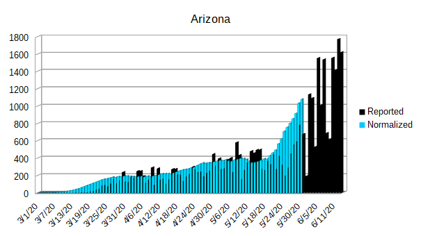
| Arizona | 1,078 |
| North Carolina | 1,057 |
| New York | 954 |
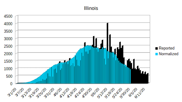
| Illinois | 946 |
| Virginia | 764 |
| Georgia | 732 |
| Maryland | 698 |
| Pennsylvania | 526 |
| Tennessee | 514 |
| New Jersey | 500 |
| Louisiana | 440 |
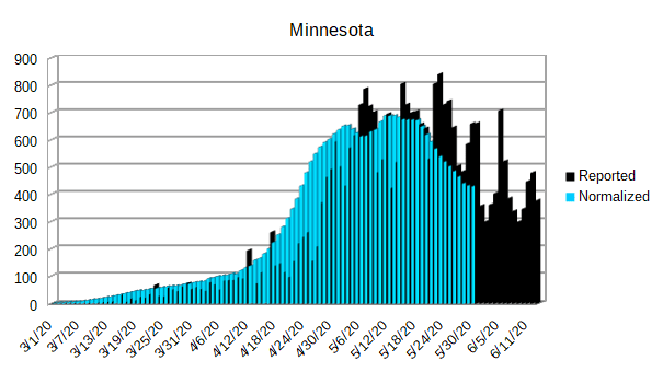
| Minnesota | 429 |
| Alabama | 424 |
| Ohio | 416 |
| South Carolina | 408 |
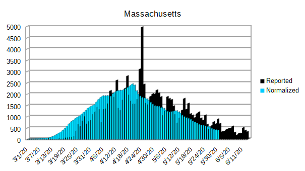
| Massachusetts | 405 |
| Indiana | 396 |
| Arkansas | 341 |
| Wisconsin | 340 |
| Utah | 329 |
| Iowa | 326 |
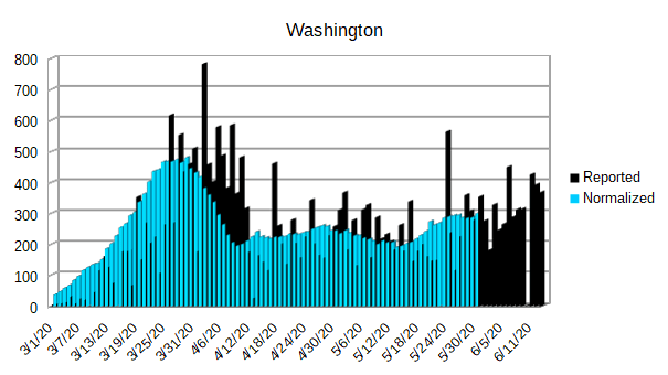
| Washington | 298 |
| Michigan | 288 |
| Mississippi | 283 |
| Colorado | 221 |
| Missouri | 214 |
| Kentucky | 211 |
| Nebraska | 204 |
| Connecticut | 199 |
| Nevada | 169 |
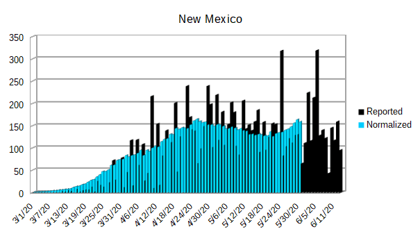
| New Mexico | 159 |
| Oklahoma | 109 |
| Kansas | 97 |
| Oregon | 84 |
| Rhode Island | 84 |
| District of Columbia | 78 |
| South Dakota | 65 |
| New Hampshire | 55 |
| Delaware | 53 |
| Idaho | 42 |
| North Dakota | 37 |
| Maine | 34 |
| West Virginia | 19 |
| Alaska | 14 |
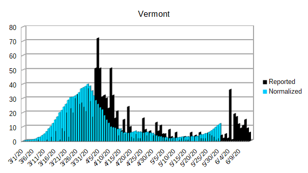
| Vermont | 12 |
| Wyoming | 9 |
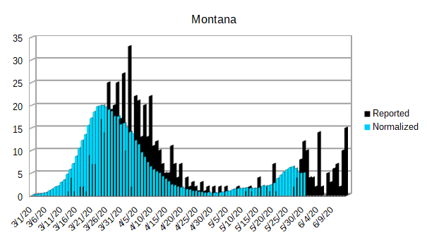
| Montana | 5 |
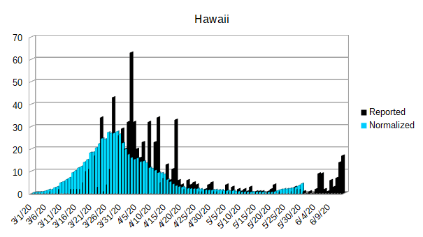
| Hawaii | 4 |
One thing that doesn’t show up in the above list is some of the dramatic increases that are happening in some of the individual states. In order to see that, you have to look at the graphs below. While the graphs don’t make it as easy to compare one state to the others as the above list does, it does make it easy to see how each individual state is doing over time.
As always, there are a few things to be aware of on each graph.
- The black cylinders indicate the reported daily infections.
- The blue cylinders indicate the normalized daily infections.
- The y-axis of each graph is best fit. That means that each y-axis is scaled to fit the data into identical sized graphs.
- The graph data begins on March 1, 2020 and goes through June 13, 2020.
- The District of Columbia is reported separate in the data, so I have graphed it separately and included it under the United States.
- I have included Puerto Rico since it is an American territory and is currently suffering its own outbreak.
- For the sake of completeness, I have also included the American territories of Guam, the Northern Mariana Islands, and the Virgin Islands. American Samoa is still excluded since they have no infections reported.
The United States seems to be stabilized somewhere in the neighborhood of 20,000 infections per day.


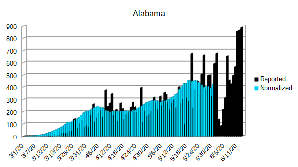
Alabama looks like it is about to get worse. The recent spike in reported cases hasn’t been completely integrated into the normalized daily infection rate, but it appears as if their trend is going up.

Arizona seems to be continuing its rapid infection rate that started about a month ago. They have already taken their place in the top five worst states for daily infections. At this rate, they will soon be in a race for first with California and Texas.

While California has broken the geometric growth of the early outbreak, they still haven’t reversed their course and began to lower their daily infections.


Florida looks to be on the rise as well. If they don’t reverse this trend soon, they will rapidly rise to the list of the most dangerous states to visit.


One thing that stands out about New Jersey is the same thing that stands out about New York. They had such incredibly bad outbreaks, yet they have managed to get them under control. While there is still work to do, they have done a remarkable job.

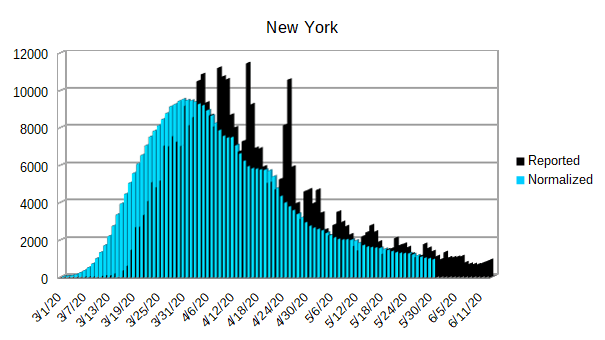
The graph of New York is amazing to look at. As the state that had the worst outbreak in the United States, they have done a phenomenal job or getting their outbreak under control. No other state has even come close to accomplishing the turnaround that New York has accomplished.
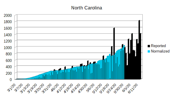
North Carolina, like California, continues to see their daily infection rates climb. They still haven’t managed to ever reach an initial peak and begin to lower their daily infection rates. Unfortunately, as of now, they are also in the top five worst states for normalized daily infection rates.


Puerto Rico is having its own outbreak, and since it is a territory of the United States, I have included a graph specifically for it.

Guam, the Northern Mariana Islands, and the Virgin Islands don’t hardly have any infections, but I have included a graph for them anyway.


