As the United States begins to open from its Covid-19 shutdown, it is important to get a baseline to see how the disease progresses as the stay-at-home orders begin to wane. To create a yardstick, I will be relying on data from Johns Hopkins University available at their GitHub page [https://github.com/CSSEGISandData/COVID-19]. After I process the data, that should give a snapshot of the condition of each individual state as well as an overall view of the United States. With the snapshot in place, it will be easier to see how the infection rate changes over time.
To process the data into easily readable form, I first take the total of infections per day and spread them out through a skewed normal curve. I use a normal graph that is skewed to the left to help distribute the raw data into the most likely time that the person was actually infected instead of the time when they received a positive test result. The downside to processing the data like this is that it is a trailing indicator. In other words, it shows what the infection rate would have been about two weeks prior to the last data available. In order to help compensate for the lag in processed data, I also put the raw data into the same chart. That makes it easier to see where the data might be going over time.
Here is a graph of the United States using the data available as of the end of the day on April 28, 2020.

The “reported” data is taken directly from the data provided by Johns Hopkins University while the “normalized” data is the same data processed through normal distribution.
With the data processed this way, it is easy to see the initial growth rate as well as when it peaked and started down.
The overall downward trend for the United States is what I would expect considering that the states that had the worst outbreaks are rapidly bringing those outbreaks under control. But this doesn’t tell the entire story. As we have all seen, the picture of the United States doesn’t necessarily indicate how each individual part is doing. There are several states that are bringing their daily infections under control while there are others that are still spreading on an exponential curve. Furthermore, as each state applies its own rules to reopening, it’s quite likely that each state will diverge from the others with respect to their infection rate.
Since showing a graph of each state every time I update would be prohibitive, I will show a few that are opening early.
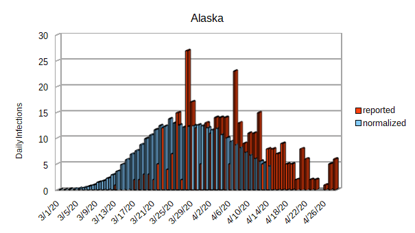
As you can see from the graph of Alaska, they seem to have their outbreak well in hand. Alaska never had a very big outbreak; notice the y-axis and that they are only getting about 5 infections per day. It shouldn’t take much of an effort to keep their outbreak under control.
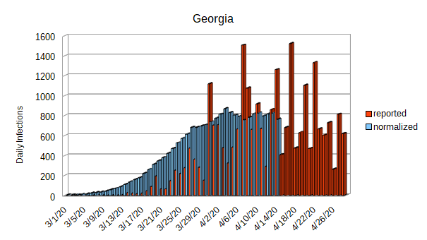
Georgia is the next state that I want to look at. While Georgia has flattened their curve, they haven’t done much to actually reduce the number of daily infections. With between 600 and 800 daily infections, it will be easy for them to slip back into a exponential growth rate. Even if they manage to escape an exponential growth rate when they begin to return to work, 600 to 800 new cases of Covid-19 per day will serve to maintain a stress on their healthcare system.
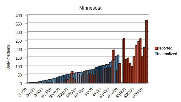
Minnesota is trying to open their economy a little bit while still maintaining their stay-at-home order. While their daily infection rate isn’t outrageous, it doesn’t appear to have reached its peak yet.

Mississippi is another state that is trying to reopen their economy. They, too, might not have reached their peak.
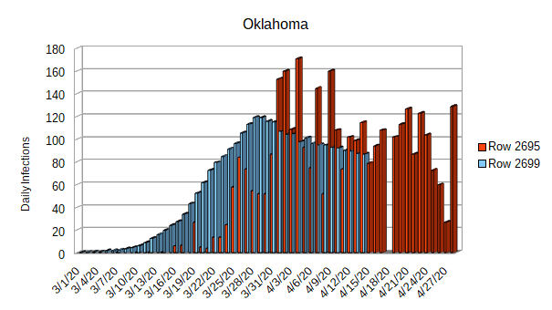
Oklahoma appears to have had an initial success of reaching their peak and even starting to reduce their daily infection rate. On the other hand, Oklahoma is being fairly aggressive in reopening their businesses. This state could be the canary in the coalmine as far as whether the daily infection rates begin to clime again after the economy starts to reopen.

South Carolina is in much the same position as Oklahoma with respect to their daily infection rate and reopening strategy. Perhaps they are another canary in the coalmine.

Finally that brings us to Tennessee. While they have flattened their curve, they don’t seem to have reduced the daily infection rate. They are also being very aggressive with their reopening plans. Over the next few days, they are going to remove all stay-at-home restrictions and rely completely on social distancing to try to maintain their daily infection rates.
And that concludes the states that are leading the charge to reopen. It will be educational to see which, if any, of these states manage to keep their daily infection rate in check. The fate of these states is in the hands of their citizens. Whether they take the threat of Covid-19 seriously when they return to work or whether they end up being the first states to require a second round of stay-at-home orders remains to be seen.
