There are several reasons to only update my data on Covid-19 once per week. The first — and probably largest — reason is that it takes quite a bit of time to create a graph for each state. Secondly, it takes several days before any trends can be detected in the raw data. And finally, I simply don’t have time to update the graphs any more frequently unless something significant appears in the raw data.
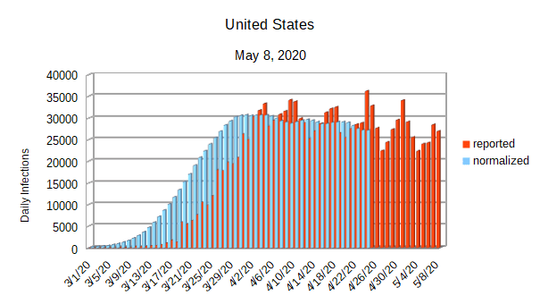
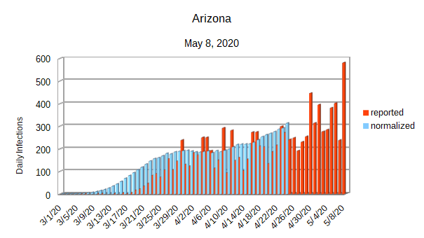
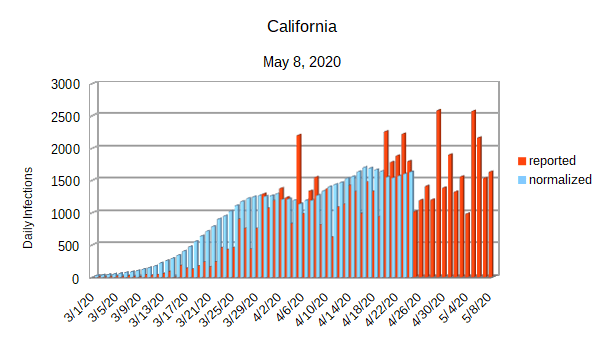
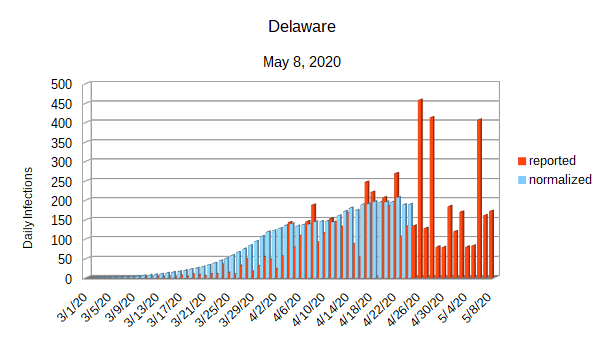
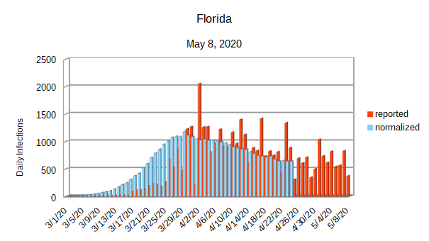
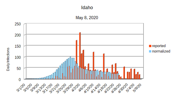
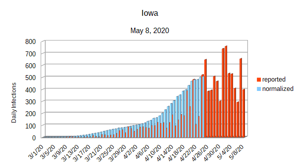
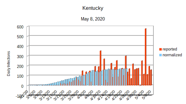
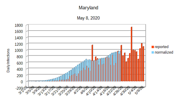
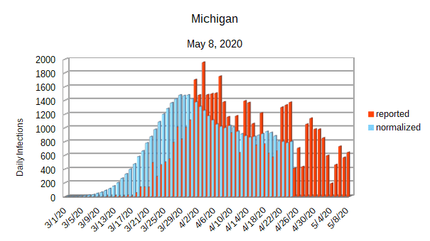
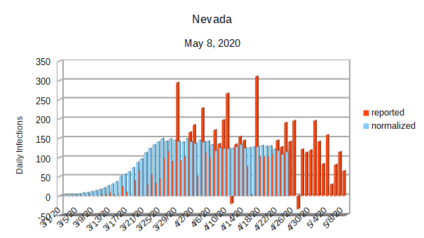
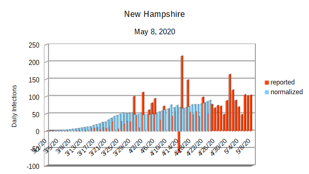
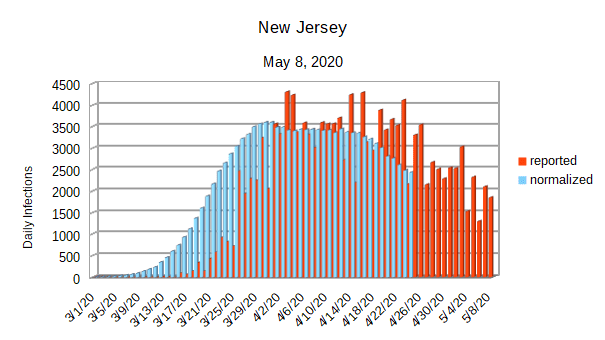
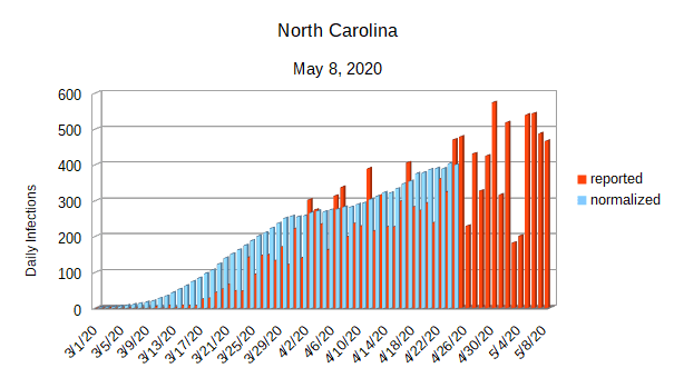
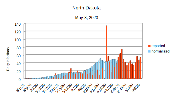
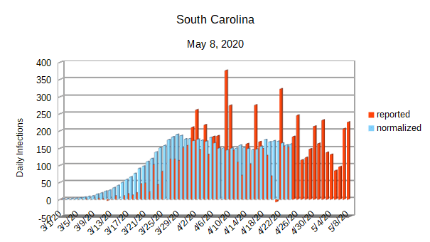
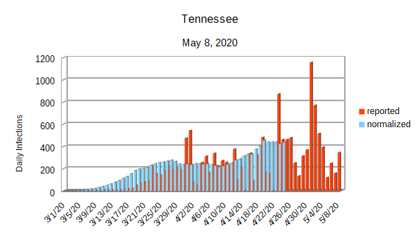
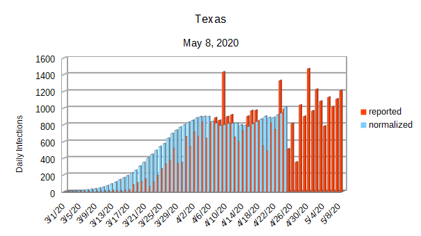
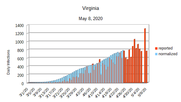
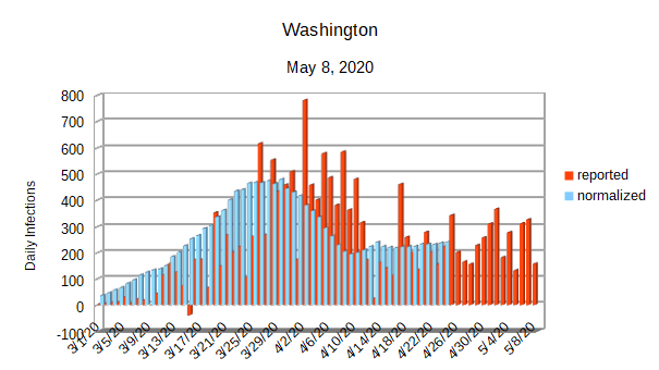
Each normalized data set is created by taking the raw data reported from the daily infection rate, using a skewed normal function to estimate the actual time the person was infected, and recording the results as a separate data set. For clarity purposes, when I create a graph, I include the raw daily infection rate in addition to the normalized daily infection rate.
The initial data set that I use to create the graphs is provided by the Center for Systems Science and Engineering (CSSE) at Johns Hopkins University. The data sets are available for download on GitHub at this location.
Finally, a few points about the data sets and the resulting graphs:
- Each graph covers the dates from March 1, 2020 through May 8, 2020.
- The x-axis contains the date.
- Since the normalized daily infection rate requires two weeks data to be spread through the normal curve, it follows the reported daily infection rate by two weeks. It is essentially an estimate of the number of infections for each date, but it can’t be any closer to the present than two weeks.
- Each graph has a best fit y-axis. That makes it easy to see how the infection rate has progressed in the area covered by the graph, but can be confusing when comparing different places unless the scale of the y-axis is taken into account.
- There should never be a negative daily infection rate reported. Some states, like Nevada, have reported negative infection rates several times. That brings into question the quality of the data that these states are reported. That said, I have used the data as reported to help prevent misunderstandings.
- Finally, I have tried to make the graphs a little bit easier to view while maintaining the same essential format as all the other graphs in this series.
If anyone is interested in a LibreOffice spreadsheet containing the raw data and calculations for creating each data set, let me know and I’ll make it available.